Body color:
It is gray with black accents, for sure.
However... what do you all think about painting the model in a mosaic of different gray tones and black. I read an article recently from the designer of the "reboot" Star Trek U.S.S. Enterprise - he commented how he was inspired by Star Trek the Motion Picture during the starting when Kirk is shuttling to the revamped NCC-1701 - you could see the mosaic coloring - it felt more like a real ship with many parts and panels - not a toy. I think that is so true and I am leaning toward painting my raider mosaic style.
I watched Classic BSG: The Hand of God last night - from what I see when Adama has his BaseStar model during his tactical briefings it is a mosaic of many grays.
Markings:
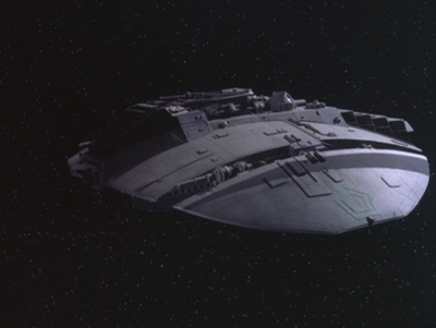
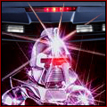
From the show (Episode Hand Of God):
The stripe of color is only black. It is high on the wing, above green Cylon logo.
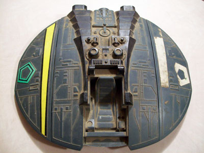
1978 toy:
The stripe of color is bright yellow with black edges. It is high on the wing, above green Cylon logo. The Cylon logo has black inbetween the green sections... so... I'm guessing the black on the stripe is just a way to use the same color ink when it was printed? Easier to just use black than try and match the gray color the toy is cast in.
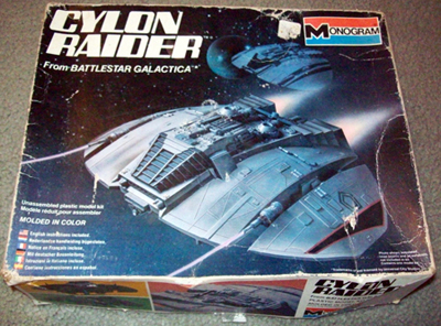
1978 Monogram model:
The stripe of color is black with bright red edges. It is at/near the wing's tips. It is below green Cylon logo.
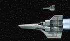
Also, I've noticed the 'other raider' on the box cover - it has no red edge to the stripe and it is up high on the wing. Seems to not have the Cylon logo - probably just due to it being more of a background element of the box art. The 'other raider' is much closer to the image above from The Hand of God?!